This presentation was also on April 8 and was all about Information Design "in Context". This was all about document design using Universal Design Principles that would allow the data within these documents to speak for itself.
He spoke about the 3-Layer Model, which incorporates:
- the look/formal aspects
- the content (shaped to the need of the audience)
- the task structure (only the information that is needed is on the document
While this presentation didn't strike me as particularly thought provoking or particularly entertaining, I did realize the span of emotions that people can feel while they are looking at a particular design. Just because I see something and have a certain reaction to it, does not mean that everyone will have that same reaction. Just because I feel like the design is good, functional, and informational, does not mean that every target audience will feel the same. I need to make my design(s) as universal as possible, which means that every group that will be using that particular product needs to be thought about during the design process.
The examples that were used during this presentation were all informational in nature. First was a comparison of University of Iowa and NAU freshman papers/immunization documents and their redesigns. The point made about these documents was that they were cluttered, hard to read, and forced apathetic users to neglect reading key points of information. After their redesigns, they were cleaner, more simple to read, and had the most key information at the right places. The redesigns were definitely in support of the lecture topic.
A second example was a series of immunization papers and records from different schools around the country. Most, if not all of these papers were cluttered with tiny margins, too-huge-font, with an unclear purpose. These papers were similar to the aforementioned example, but had never been redesigned. Using this example made it very clear exactly how crucial it is to check and recheck designs and make sure they are always legible and functional. While the paper themselves was not aligned with the topic, the idea that they presented definitely was.
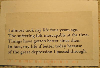
The third example were Medical Decision "Aids" targeted at Diabetes patients. This is the example that brought up the idea of "emotional reaction". The different cards were made according to different design elements, so one was all text, one was all images, and several were a mix. The users questioned about the cards reported specific emotional reactions to certain cards, feeling some were too "sad" or "scary" while others were "friendly" or "inviting". These cards, no matter their design principle, were easy to read and had no informational fillers, so to speak. This example also supported the lecture topic.
Thanks to this lecture, it is definitely clear to me that even something like Information Design, that we as designers may not always think about, is really important and can make or break a design. It is something that we should always just be thinking about in order to make the best designs we can.