PostSecret is a project started by Arizona born, Maryland native Frank Warren. This project allows readers to submit handmade secrets to Frank to allow them to heal from their secrets anonymously. He began the Reluctant Oracle project in 2004, which ultimately transformed into PostSecret later on. Now in 2010, Frank has received over 500,000 secrets, has 5 books and two websites, has appeared on many talk shows and news reports, tours colleges all over the states (and actually just appeared here on April 15), has poured countless donations and hours of help into HOPELINE (1-800-SUICIDE), and has been called the "Most Trusted Stranger in America".
I have been an avid reader of PostSecret for a few years and have presented a few seminars on how to use it within a residence hall. During this time, I have thought a lot about what makes these secrets so special- both to the secret-holder and to the reader. Each and every secret is unique, like a snowflake. Nearly all of them have custom art and hand drawn lettering on them. It seems to me as though the person creating the secret wants to convey a certain tone or style with their entry. They want it to look a certain way in order to create feelings in themselves or the reader. Even if it is not quite that deep, they are pouring their heart and souls into these secrets so they feel a deeper sense of possession, yet release. The following secrets were taken both from my own ACLC PostSecret project and the real PS.
This first secret was taken from ACLC PostSecret. This secret really speaks to me on many levels, mainly because of its subject matter. The type helps the subject matter in a few ways. The hand-drawn block letters spelling out "form" give the message a certain weight, yes, but also a certain emotional heaviness and emphasis that could only come from something like this. The aesthetic differences between the first few words and the last word aid in this. Also, the drastic differences between the hand-drawn lettering and the medicine label create a very stark difference that could only be described as black and white, similar to the tone/message the secret is trying to convey.
This secret was also from ACLC PostSecret. I found this secret pretty silly, mainly because of the image and the design of the card. I really like the colors they chose- it creates a very "in your face" statement. The bite mark in the top is hilarious. Moreover, I really like the weight of the word "Meat"...it makes it seem like almost an evil word, as if meat is the entire bane of their existence. It is, after all, the whole purpose of the card. Putting the word in bright red marker only helped this feeling, as it forces it to stand out from the rest of the secret. This has really been one of my favorite secrets of this year.
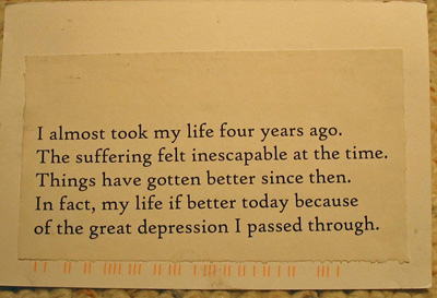
This last secret has come from the real PS archive. While this one has no art and isn't hand lettered, the stark reality of this secret speaks to me in volumes that the others can't. The font face- High Tower- isn't a commonly used "professional" font but still works incredibly well for this secret. The secret is so simple and beautiful, yet so empty (compared with other secrets). It is for this reason that the type choice is so wonderful. The incredibly blunt idea of taking your own life is a very scary, stagnant, empty feeling as conveyed in this secret. The type definitely portrays that. Would the same tone be conveyed without this crucial design element? I don't really think so. Even though the secret talks about getting better, depression is something that needs to be worked on every day...it doesn't necessarily get easier. The author of this secret was able to put their emotions into this secret using only design and type choice. That's amazing.
This secret has taught me that I have as much power in my fingertips as I want. I just have to make the right choices.
Sunday, April 18, 2010
Journal Entry 11: PostSecret
Posted by Rachel at 1:58 PM
Labels: Miscellaneous
Subscribe to:
Post Comments (Atom)


0 comments:
Post a Comment